Inflation, Inflation, Inflation – When will it end?
If you’re like us, then you are pretty tired of hearing about (and dealing with) the high inflation that we have been experiencing. It truly has been “sticky” and relentless, like a gnat at a barbecue that just won’t leave you alone. The Fed has aggressively been trying to combat and reduce inflation for a while now, but thus far, it has not yet been enough to meaningfully make a dent. Between causing market volatility and a more hawkish Fed (and of course, higher prices on personal good and services), inflation has been a thorn in our sides that seemingly just won’t quit.
So where is this inflation coming from? And, how long do we think it might last? Let’s take a look…
Where is the inflation coming from?
The following chart shows the components of the Consumer Price Index (CPI) when looking under the hood. As you can see, shelter (home prices and rents), food and energy make up the largest components. On the most recent inflation report for September, energy was the main bright spot showing a decrease of 2.1% from the prior month, but food was up 0.8% while shelter was up 0.7% (mainly driven by increasing rents). Given the latter two make up nearly half of CPI, it is fairly clear why inflation has continued to stay high. On the shelter side specifically, this is especially sticky when you consider rents, which are generally locked with lease terms of a year or longer. Additionally, shelter prices are also a lagging indicator when it comes to CPI readings, so it can generally take several months for any potential decrease to show up in the official numbers (more on that in a moment).
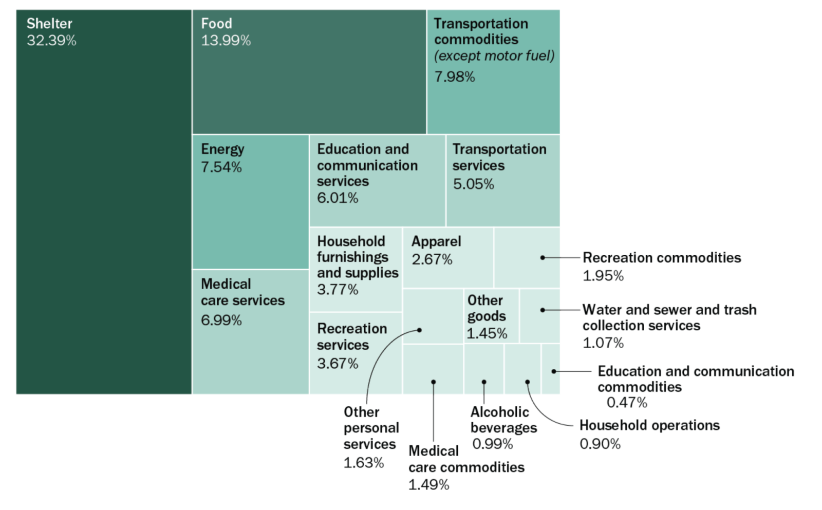
Source: Bureau of Labor Statistics, Pew Research Center (data as of 11/30/21)
Over the last 12 months, the contributors to inflation have shifted. Starting in late summer 2021, supply chain bottlenecks combined with explosive post-COVID demand boosted prices. New demand for travel drove up hospitality, hotel, and restaurant prices as Americans wanted to get out and spend. At the same time, demand for homes increased as work-from-home became a more solidified part of work life, leading to an uptick in home sales as well. Since then, some of these costs have come down (such as energy) while others (such as food-at-home costs) increased. What has remained constant and “sticky” has been both food and shelter, and those are the two main culprits keeping inflation high at this stage. The following chart depicts these trends and contributors to inflation since August 2021:
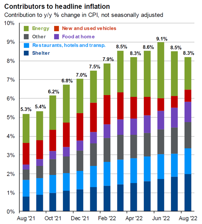
Source: JP Morgan Asset Management (as of 9/30/22)
Silver Linings & Hope on the Horizon?
While it may not seem like it right now, there are several reasons to have hope that inflation has finally peaked, and we may start seeing meaningful decreases soon. First off, looking at overall inflation on a month-to-month basis, inflation has not been increasing at the same breakneck pace. From September through June 2021, inflation was growing 0.7-0.8%/month on average, but since then, growth has cooled to 0.4% or lower as evidenced in the following chart:

Source: Bureau of Labor Statistics (as of 9/30/22)
Looking at the housing market, we are starting to see signs of cooling prices as evidenced by the following chart. Existing and pending home sales, as well as mortgage originations, have all dropped. This should translate to lower prices in the coming months as demand wanes. We are also starting to see major home prices indices, such as the Case-Shiller National Home Price Index and the Case-Shiller Composite 20 Price Index (measuring 20 major metro US cities), beginning to fall as well.
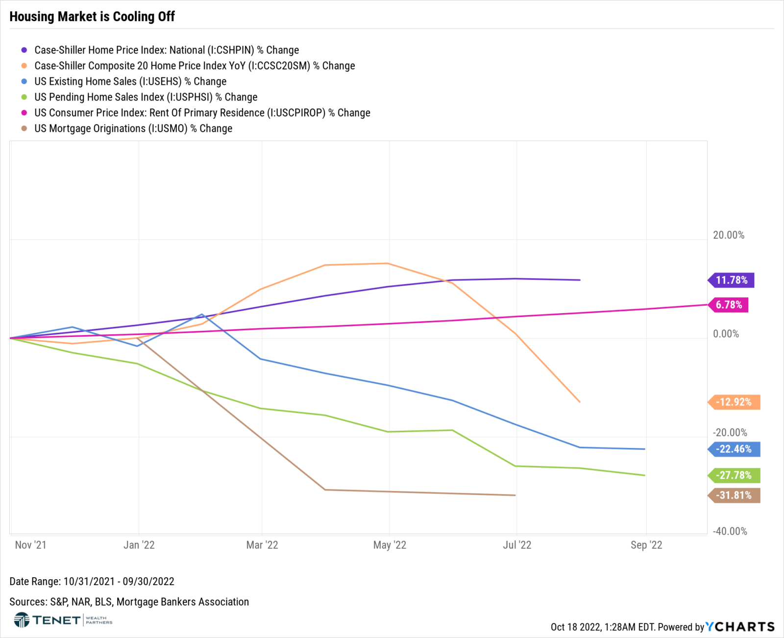
Another important note is that shelter data lags by several months. For example, indices such as Case-Shiller lag by two months and show a 3-month average, while the Consumer Price Index (CPI) shelter data also lags by about 6-12 months. With respect to rent prices specifically, the Bureau of Labor Statistics (BLS) is responsible for collecting survey data from 50,000 tenants/landlords, which is how shelter price data is collected for CPI. The BLS only samples units once every six months, and then they smooth the price changes over 6 months as well. Since rental leases are generally 12 months or longer, this creates a multi-month lag between where rent prices actually stand today. When we look at more private data sources, such as the Observed Rent Index from Zillow as well as the Median Rent Report from Realtor.com, the data on rent prices shows a more promising picture and outlook:
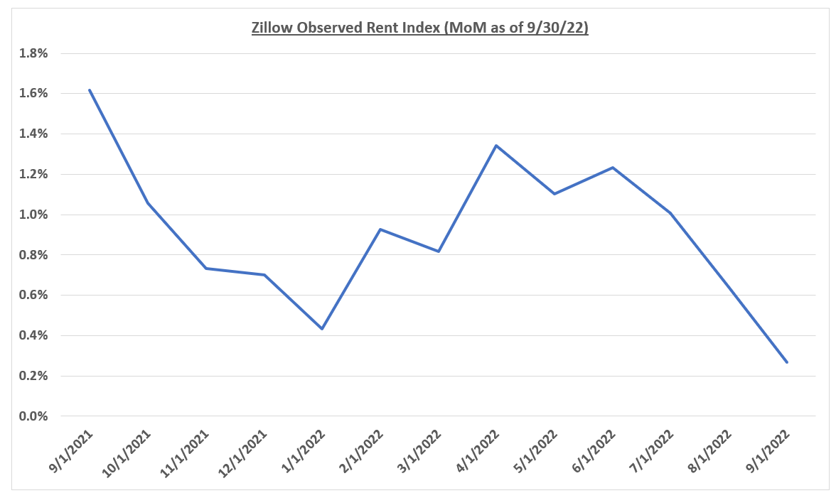
Source: Zillow (as of 9/30/22)
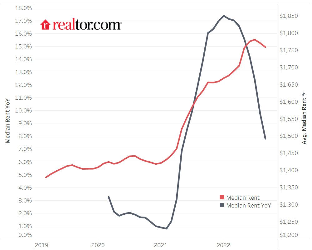
Source: Realtor.com (data as of 8/31/22)
Now pivoting back to another positive sign referenced earlier: supply chains continue to improve. While we are still certainly dealing with supply chain delays for several goods, the picture is looking less strained. Deliver times have become faster, and both manufacturing output and input (raw material) prices have come down significantly as shown in the following two charts:
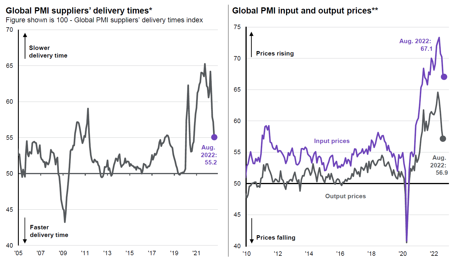
Source: JP Morgan Asset Management (as of 9/30/22)
Additionally, related to supply chain, energy prices have continued their downward trend as well. Combined with a less strained supply chain, this may also result in lower food prices as well given that a portion of those costs are related to transport.
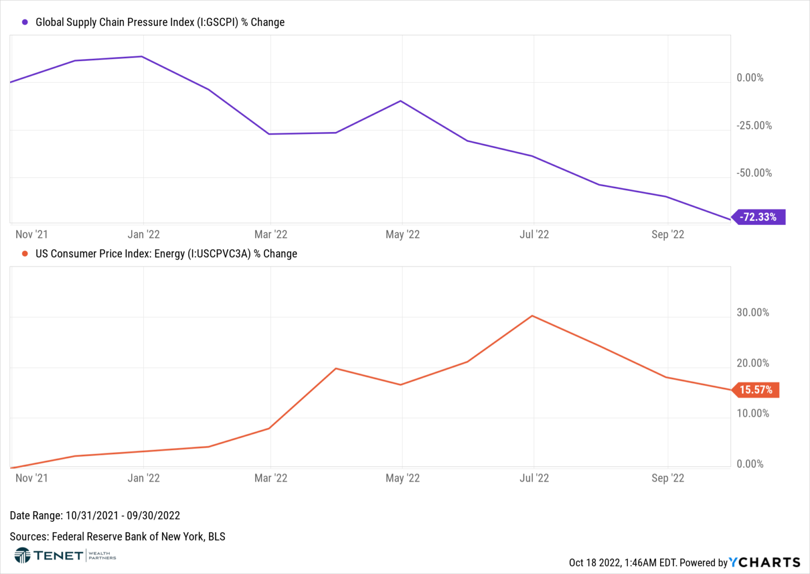
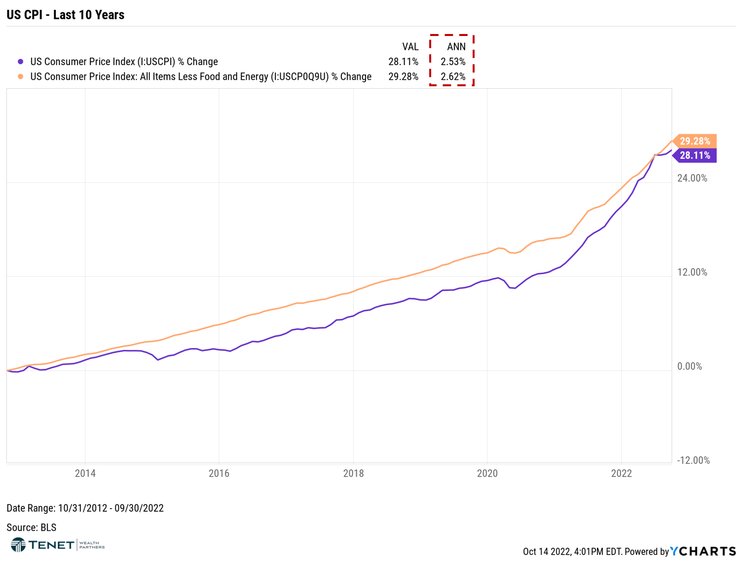
Two final points on the positive front: (1) When spread out over a 10+ year period, average inflation is lower and more reasonable. (2) Overall, the US economy remains well-balanced.
Regarding the first point, it is important to view inflation from a longer-term perspective, similar to how we view and assess investment results and financial goals. Because inflation is the highest it has been since the 1980s, it is easy to look at the “here and now” and how it is impacting consumers currently. However, inflation was also incredibly low in the 8-9 years leading up to this stage. Case in point, the following chart looks at CPI over the trailing 10 years and then provides annualized rates at the top, which shows average inflation of ~2.5%.
Lastly, while not directly related to inflation data, it is important to point out that the economy is still on strong footing. Beyond the impact on personal spending, investors’ main worry of inflation is that the Federal Reserve may hike rates too much and inevitably cause a recession. It is still very possible that we end up in that space sometime in 2023, but we at least have a well-balanced, robust foundation right now. The following chart is a “heat map” that shows areas of the economy that are positive/balanced (blue) or negative/imbalanced (red). Even though valuations and debt levels are extended in some areas, these imbalances seem to be modest compared with Great Recession and Dot-Com timeframes, so the overall measure shows that our economy is still very well-balanced.
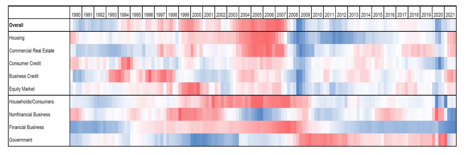
Source: Goldman Sachs Investment Research (dated 10/6/22)
We believe that inflation (and the Federal Reserve) will continue to dominate the minds of investors in the near term, and it will likely stay that way well into next year. With that being said, several of the above factors paint a more optimistic outlook for what’s to come, which should translate to a less aggressive Fed and (hopefully) a subsequent market comeback. Until then, we will just need to keep dealing with this nagging inflation for a while longer.
As always, if you have any questions on these points and/or potential implications for your portfolio strategy, please don’t hesitate to contact our team!
Sources: YCharts, Bureau of Labor Statistics, St. Louis Federal Reserve, Bloomberg, CNBC, Wall Street Journal, Realtor.com, JP Morgan Asset Management, Pew Research Center, Fortune, S&P Global, Goldman Sachs Investment Research, Zillow, Apartment List, Federal Reserve Bank of New York, National Association of Realtors, Mortgage Bankers Association
Investment advisory services offered through Tenet Wealth Partners, LLC, a registered investment advisor with the U.S. Securities and Exchange Commission. This material is intended for informational purposes only. It should not be construed as legal or tax advice and is not intended to replace the advice of a qualified attorney or tax advisor. This information is not an offer or a solicitation to buy or sell securities. The information contained may have been compiled from third-party sources and is believed to be reliable.
The information provided in this communication was sourced by Tenet Wealth Partners through public information and public channels and is in no way proprietary to Tenet Wealth Partners, nor is the information provided Tenet Wealth Partner’s position, recommendation or investment advice. This material is provided for informational/educational purposes only. This material is not intended to constitute legal, tax, investment or financial advice. Investments are subject to risk, including but not limited to market and interest rate fluctuations.
Any performance data represents past performance which is no guarantee of future results. Prices/yields/figures mentioned herein are as of the date noted unless indicated otherwise. All figures subject to market fluctuation and change. Additional information available upon request.
